Getting Started1 min
Design Tokens20 min
Creating Themes2 min
Component Designer1 min
Documenting Design System15 min
Arrange Pages and FoldersCustomize ApperanceWriting Text ContentDocument Widgets➥Design System WidgetsPage HeroPreview and Share
Exporting Design Tokens5 min
GraphQL API4 min
Real Content4 min
Figma Plugin10 min
Adobe XD Plugin8 min
Real-time Collaboration4 min
FAQs
Learn
Design System Widgets
These widgets are connected to your design system repository and therefore they are in full-sync with your design tokens and components . With this feature, your documents are always up to date with your design system.
Displaying Tokens
Token widgets let you pull and list design tokens from your design system.
When you add a token widget, the wizard then lists the token types . Selecting a token type will add the widget displaying all the tokens in your design system. Then you can customize the appearance and arrange the token items to be listed.
Changing design token values from Toolabs DSM panel or from plugins for Adobe XD and Figma is automatically reflected on the token widgets in documents.
You will also see the changes when any team member changes the design tokens in real-time editing mode.
Customizing Appearance
You can customize the appearance of tokens from the top toolbar which is shown when the mouse is over the widget.
Customizable options include alignment, width, height, and list modes which vary according to the widget type.
Adding more options is on our roadmap. When Toolabs component designer module is available, it will also be possible to design your own Token Widgets and use them in your documents.
Arranging Token Items
By default, a token widget displays all of the design tokens of the selected token type from your design system.
If you want to show only specific tokens , then you need to apply filters from the configuration panel on the right by clicking the Token Options button on the top toolbar.
The configuration panel lets you filter and sort the items to be listed in the widget.
If you grouped your design tokens under categories in your design system, then you can also filter the tokens by those categories . If you add to or remove any token from those groups, the change will automatically be reflected here.
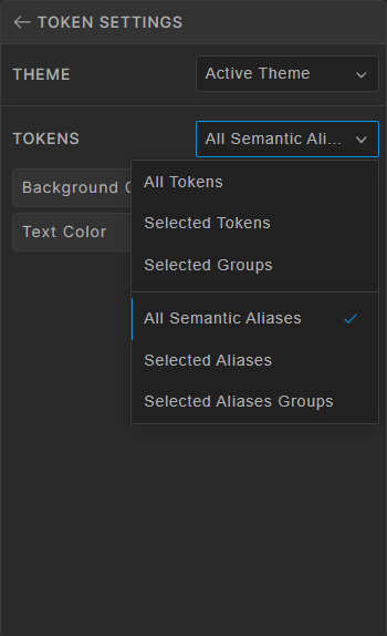
You can also select to show only Semantic Token Aliases from the configuration panel and then apply filter and sorting options in the same way. You can learn more about Semantic Token Aliases here.

Applying Theme Options
By default, token widgets use the active global theme of the document. But it is possible to break this in two ways :
➥ Open the token configuration panel from the top toolbar, select the Specific Theme option and then switch the theme from the Theme Switcher to be used for the tokens in this widget.
➥ Open the token configuration panel from the top toolbar, select the Theme Selector option. This option will show the Theme Switcher control above the tokens in the widget and therefore the user of the document will be able to manually switch the theme for tokens in this widget.
Exporting Tokens
Token Export widgets are similar to display widgets except they show and let the user copy or download the code for the tokens in the widget.
The widget provides the option for generating code in various formats: CSS, Less, Sass, JSON, YAML, Jawascript, Swift, or Android. .
Naming and other formatting parameters are taken from the configuration made in the Export Tokens page of Toolabs DSM.
Color Contrast Accessibility Widget
This widget lets you show the color contrast ratio between two selected color tokens. The ratio is calculated on the fly. Therefore, if the value of any of these tokens changes, the ratio will be recalculated and show the current accessibility level.